Responsive design tricks for mobile-friendly pages
Responsive Design Tricks for Mobile-Friendly Pages: A Global Guide for Business Owners
In today’s digital-first world, a mobile-friendly website is no longer optional—it’s essential. With over 60% of global web traffic originating from mobile devices, ensuring your site delivers a seamless experience across all screen sizes is crucial for business success.
For entrepreneurs and brand startups worldwide—especially in markets like the USA, Japan, France, and Canada—adopting responsive web design (RWD) can significantly enhance user engagement, boost SEO rankings, and increase conversions. This comprehensive guide explores actionable strategies to optimize your website for mobile users, leveraging the latest industry insights and best practices.
What Is Responsive Web Design?
Responsive Web Design is an approach to web design aimed at crafting websites.w3schools.com provide an optimal viewing experience across a wide range of devices. This includes easy reading and navigation with a minimum of resizing, panning, and scrolling—across desktops, tablets, and smartphones. w3schools.com
Why Mobile Optimization Matters
1. Enhanced User Experience
A mobile-optimized site ensures that users can easily navigate and interact with your content, leading to increased satisfaction and engagement.
2. Improved SEO Rankings
Search engines like Google prioritize mobile-friendly websites in their rankings, making mobile optimization a critical factor for visibility.
3. Higher Conversion Rates
A seamless mobile experience can lead to higher conversion rates, as users are more likely to complete desired actions when the site is easy to use on their devices.
Essential Responsive Design Techniques
1. Adopt a Mobile-First Approach
Begin designing your website with mobile users in mind. This strategy ensures that the core content and functionality are optimized for smaller screens before scaling up to larger devices.
2. Utilize Fluid Grid Layouts
Implement fluid grids that use relative units like percentages instead of fixed units like pixels. This allows your layout to adapt to various screen sizes, ensuring consistent presentation across devices. Medium
3. Implement Media Queries
Use CSS media queries to apply different styles based on device characteristics such as screen width, height, and orientation. This enables you to tailor the layout and design to specific devices.
4. Optimize Images and Media
Ensure that images and media files are responsive by setting their maximum width to 100% and height to auto. This prevents overflow and maintains aspect ratios across devices.
5. Simplify Navigation
Streamline navigation menus to enhance usability on mobile devices. Consider using hamburger menus or bottom navigation bars to save space and improve accessibility.
6. Prioritize Touch-Friendly Elements
Design interactive elements, such as buttons and links, to be easily tappable. Ensure they are large enough to be selected with a finger and are spaced adequately to prevent accidental clicks.
7. Test Across Multiple Devices
Regularly test your website on various devices and browsers to identify and fix any issues. Tools like BrowserStack and Google’s Mobile-Friendly Test can simulate different environments to ensure compatibility.
Advanced Techniques for Enhanced Mobile Optimization
1. Implement the T-Layout
The T-Layout is a mobile web application layout that features a horizontally scrollable container divided into three distinct sections. This design optimizes space usage and streamlines navigation, catering to one-handed use on mobile devices.
2. Utilize Modular Responsive Web Design
Incorporate modular responsive design by using element queries, which allow components to adapt based on their local context rather than the global context. This approach enhances reusability and scalability of design elements.
3. Focus on Performance Optimization
Optimize your website’s performance by minimizing the use of large files, compressing images, and leveraging content delivery networks (CDNs). This reduces load times, which is crucial for mobile users who may have slower internet connections.
Global Trends in Mobile Web Design
1. Mobile-First Indexing
Google’s mobile-first indexing means that the mobile version of your website is considered the primary version for ranking purposes. ucraft.com underscores the importance of optimizing your mobile site.
2. International Collaboration
With the rise of global e-commerce, businesses are collaborating internationally to enhance their mobile web presence. This includes adopting universal design standards and localized content to cater to diverse audiences.
Tools and Platforms for Mobile Optimization
-
Figma: A collaborative design tool that offers templates and resources for creating mobile-friendly websites.
-
Adobe Express: Provides design best practices and templates focused on mobile-first content creation.
-
Leadpages: Offers mobile website design best practices and templates to ensure a seamless mobile experience.
Conclusion
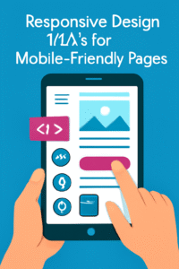
“A vibrant digital illustration demonstrating responsive design techniques for creating mobile-friendly web pages. The image features a tablet displaying key design elements like icons, text, and a call-to-action button, highlighting essential strategies for optimizing websites for mobile devices.” is crucial for businesses aiming to provide an optimal user experience across all devices. By adopting a mobile-first approach, utilizing fluid grids and media queries, and focusing on performance optimization, you can enhance your website’s usability and accessibility.
If you’re looking to elevate your brand’s digital presence, consider leveraging the expertise of thedigitalmarketing.services. Our team specializes in responsive web design and can help you create a mobile-friendly website that drives engagement and conversions.
Call to Action
Ready to adopt Responsive design tricks for mobile-friendly pages? Which can transform your website into a mobile-friendly powerhouse? Contact thedigitalmarketing.services today to get started on your responsive web design journey.
Aute mi ut suspendisse velit leo, vel risus ac. Amet dui dignissim fermentum malesuada auctor volutpat, vestibulum ipsum nulla.
Sed reprehenderit quam, non felis, erat cum a, gravida lorem a. Ultricies in pellentesque ipsum arcu ipsum ridiculus velit magna, ut a elit est. Ultricies metus arcu sed massa. Massa suspendisse lorem turpis ac.
Massa suspendisse lorem turpis ac. Pellentesque volutpat faucibus pellentesque velit in, leo odio molestie, magnis vitae condimentum.